Q&A: How The Creative Pack Elevates Private Label Packaging
As private label product sales continue to grow, retailers should be looking to stand out from their competition.
While creating unique, high-quality products is typically the main goal of private brands, the products also must stand out on shelves and catch the attention of consumers. Packaging design, including color schemes, pattern designs and more, is a major factor in a product’s ability to stand out.
The Creative Pack is a California-based design firm that works with retailers to create eye-catching and engaging private label product packaging. Store Brands recently spoke with Danielle Kidney, founder of the design firm, to learn more about the company’s mission, how it approaches private label projects, design schemes and more.
STORE BRANDS: Describe the mission of The Creative Pack, and the extent to which the company works with private brands.
DANIELLE KIDNEY: We are a close-knit team and we love that we get to help clients capture their creative vision. Our mission is to extend that love through every step of the creative process. We are known for brand & packaging design but we offer additional brand support such as photography, illustration, copywriting and retail readiness.
Our expertise in packaging is what has put us on the map, particularly private label brand packaging. So, we have always had a strong focus on private brand work. Our private brand clients and retailers account for about 60% of our work, the rest being CPG clients and brands.
SB: When designing private label packaging, what does the process look like, and what are the main objectives?
DK: Step 1 for a new private label brand/client, we like to start with a strong strategy that comes from a clear brief, thorough consumer trend research and a competitor review. Then we align expectations with a launch timeline to create a critical path. Step 2 is where the design process begins. Our team will do a full audit of the current branding (if there are existing assets to see where it stands today).
For conceptualizing purposes, we often tackle the most challenging categories or difficult pack formats first to ensure we end up with a fool-proof design. Mood boards help us define our visual direction and set the tone for how we will bring ideas to life on pack. At this stage, it’s important to include as much accurate information as possible, like product callouts and attributes such as organic, non-GMO, etc.
After we share the design concepts (usually 2-3 directions) with the stakeholders, they choose a direction and we do further developments based on feedback. Step 3 is artwork approval and production. Once we have an approved design concept, we collect all assets such as die lines, imagery and fonts to roll out the print-ready artwork, taking the chosen design onto all SKUs and flavors within the range.
From Step 1 to Step 3, our creative process can take anywhere from four weeks to four months depending on the project. We always lead with the objective to create a brand that is ownable with a strong presence. It’s important to note that packaging has a lead time of 4-12 weeks to print and produce, and because it can be expensive to reprint or change, each print run can last 2-3 years or more.
SB: When designing private label products, is the goal to stand out versus branded items?
DK: Yes, most brands want to stand out on the shelf, but it is no longer that simple. In general, the goal is typically differentiation. It’s important to consider things like category cues, price point and the overall feeling a design can provide a consumer. Yes, a bright red carton of organic milk may visually draw you in at first, but does it give you a feeling of trust and safety? Does it communicate commodity over quality?
In addition, the shelf (for many) is now digital, giving each brand the power to control what the consumer is viewing, independent of their competition, meaning, they may never even see that red carton of organic milk. So, I think it always comes down to understanding your brand audience first (inherent values, shopping habits, price expectations) followed by the product environment. This way the consumer feels considered, and hopefully comes back again and again, building up that brand loyalty.
SB: What colors and design schemes have worked best for private label products?
DK: This totally depends on the brand we’re designing for and their brand strategy. We do know color is the most immediate and memorable visual tool available to us, and we use a full color wheel to assess the competition's position within the market at the beginning of each project.
However, typically when rolling out a new range of products within an existing private label program, there is a color palette established, along with imagery and font guidelines to follow. From there it’s a matter of reviewing the context of the product range, as well as the flavor profile offering (chocolate, strawberry, vanilla, etc).
In the case of creating a private label brand from scratch, many of the design and color choices come down to the following considerations: Who is your audience for this product? Where will the product be merchandised? What are the most successful competitors doing? Are there category visual cues or trends to consider? Are we maintaining overarching brand standards – meaning the store itself?
SB: Could you share some examples?
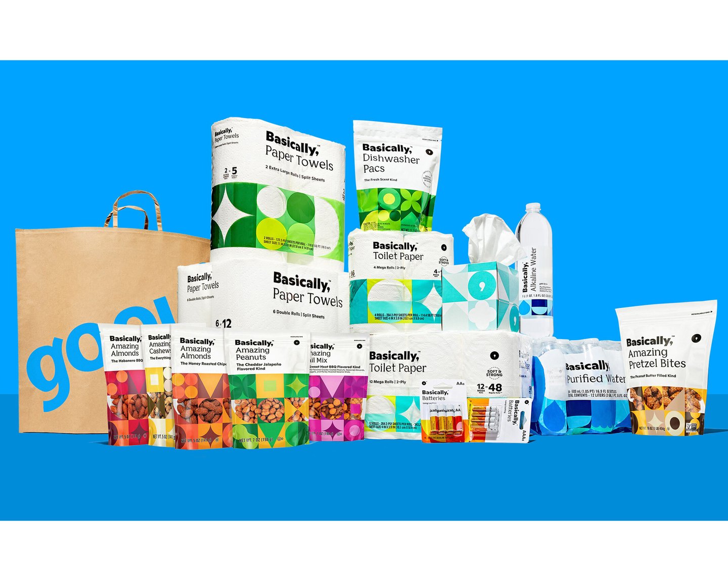
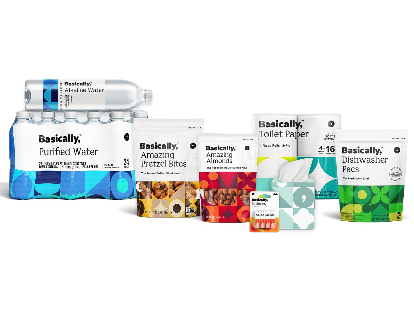
DK: Sure. Gopuff is a great example. We partnered with Gopuff to help launch their private label brand, Basically - ‘The things you need in a pinch, available with the tap of a finger, for a great price.’ This brand aesthetic relies heavily on color and pattern, but covers a broad product range – from batteries to toilet paper to gummy bears.
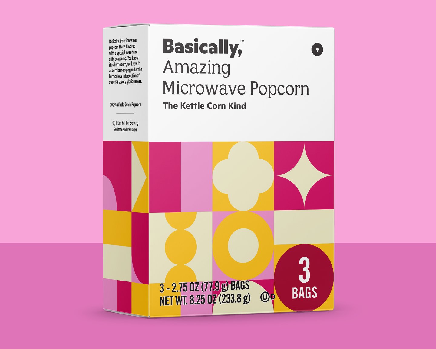
Primarily, consumers are interacting with this brand over digital media, but even so, we need consumers to instantly understand what type of product they are viewing. For example, Basically has a set rotation of approved color combinations to apply during the artwork phase, but when it came to their Amazing Microwave Popcorn, none of the pre-existing options were hitting the mark, simply because the pre-existing category cues within popcorn were so dominant.
We had to flex. We were able to introduce two new alternative combos to expand the color system, which also allowed us to think ahead on color expectations for their future line list, particularly within the food and grocery categories.
SB: Is there a constant line of communication with the retailer to focus on communicating a brand story?
DK: Yes, I think this is one of our TCP super powers. Our project management team, including myself, works hard to be ultra-consistent with client team members through all phases of the project. The retailer/client is involved in all parts of decision-making.
Often times in the world of private label brands, there are multiple category leaders with multiple brand visions. It’s our job to bring the ideas together in a logical manner and get everyone across the finish line with a cohesive brand story. This line of client communication trickles down through our design team daily, so we are all aligned on the brand goals, even when things inevitably twist and turn.
SB: Private label products have seen unit and dollar sales grow over the past 18 months. Where does a strong product design fit in with ongoing growth, especially as retailers continue to expand private label offerings?
DK: We have always been of the belief that design we create should be relevant today, tomorrow and five years from now. At the beginning of a private label brand partnership, we closely review the consumer market trends and include our findings in the overarching brand roadmap.
Often times, this research helps everyone involved to avoid jumping on the trend band wagon or requesting a ‘me too’ of a popular brand competitor. If a trend is already out there, it’s too late to join in. We want our clients to be ahead of the curve, create their own trends, or better yet, carve out their own path that sets them up for long term success and growth. And that means we need to consider longevity from day one.
There is always an element of surprise that’s waiting down the road. This means we must create a design system with flexibility to keep up with ever-changing growth opportunities. Having a private label brand presence for a retailer is a base level expectation now. To be noticed in the private label brand industry, you need to check at least two of three categories: high quality products (transparent sourcing and high level certifications), product or flavor innovation, and the convenience factor (competitive pricing, delivery options) – something that makes the consumer’s life a little easier


