Casey’s branding gets an upgrade


Casey’s General Stores has revamped its logo and branding, moving toward a more modern, scripted look that the company said reflects its future while staying true to its small-town roots.
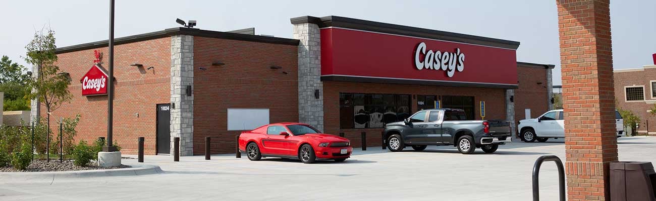
The original logo with the brown roof and Old-West look of the “General Store” type has been replaced with a red silhouette of a barn and a refreshed, more scripted “Casey’s”.
The branding will be updated on Casey's own brand packaging beginning in October, which the retailer recently said expects to make a bigger priority.
A new store in Ankeny, Iowa will be the first in the company’s 16-state footprint to feature the updated visual look outside and a more contemporary feel inside. The store features its same, popular pizza and freshly baked foodservice items. Casey’s operates more than 2,000 locations in total.
The more contemporary look is to reflect recent moves by the retailer that point to a more modern model of shopping such as a new loyalty program, digital tools and curbside pickup.

“For half a century, Casey’s logo has stood as a beacon for good food, convenience and community in the lives of the neighbors, friends and family that our committed team members serve every day,” said Darren Rebelez, CEO, Casey’s. “Embracing this heritage, we are proud to remain at the heart of every community we serve as we give guests and communities even more reasons to shop at Casey’s.”
A new ad campaign behind the look begins this month, including television spots, outdoor and digital ads, and the new packaging to come. The logo was designed by Interbrand.