5 design trends to help packages stand out

The message derived from a new whitepaper by Daymon is another call for grocery retailers to differentiate through their private brands. If you’re a retailer that’s doing this, keep forging ahead. If you’re a retailer that’s not doing this, what in the name of Southern banana pudding ice cream are you waiting for?
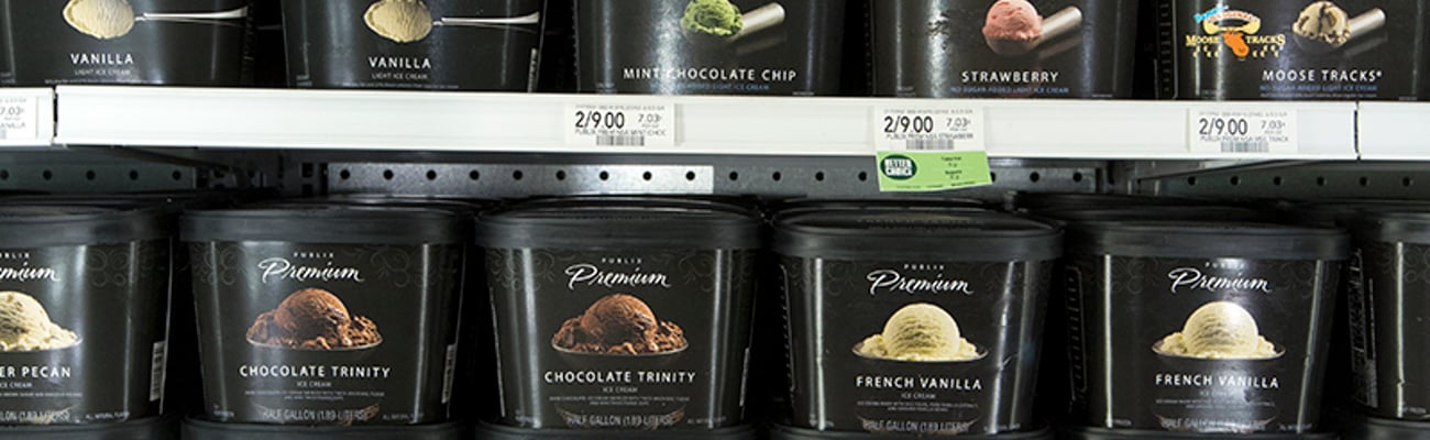
I mention Southern banana pudding ice cream because it’s offered — along with many other scrumptious flavors — by Publix Super Markets, which is celebrated by shoppers for its private-branded frozen desserts. People go to Publix to buy its ice cream. They consider Publix’s offerings as exclusive. When you offer Southern banana pudding ice cream to your customers, you are differentiating.
But the packaging on such products also has to be different. It has to stand out, which is the message from Daymon’s 2019 Packaging Design whitepaper.
Daymon, a Stamford, Conn.-based retail services company that specializes in private brands, points out something early on in the whitepaper that most retailers already know — that 98% of a retailer’s national brand assortment is the same as their competition.
“… which means private brand is the primary source for innovation and differentiation — and packaging design can often be crucial to showcasing that differentiation,” according to Daymon.
Daymon learned in its recent 2019 Private Brand Intelligence Report that 85% of consumers trust private brands as much as national brands; 81% buy private brands on every or almost every shopping trip; and that 53% say they shop at a store specifically for its private brand.
These numbers have never been higher, and they will keep going up.
So the point Daymon is making in the whitepaper is that shoppers are giving retailers permission to innovate in private brands. And packaging plays a major role in this.
“Keeping your brands on trend visually will give them greater standout on shelf, make them easier to shop and help to elevate the quality perception of the products,” the whitepaper states.
Daymon offers five design trends for private brands to keep them on trend visually. No. 1 on the list is might not what you think it should be, but it makes total sense. It’s “simplicity.”
“Simplicity is powerful as it conveys a targeted message to consumers,” according to Daymon. “Streamlined designs stand out as they bring a cleaner presentation to the shelf while still being effective in communicating differences to the consumer.”
No. 2 is “color impact,” which seems a no-brainer but can never be underestimated. “As a brand asset, color creates consistency across categories and improves consumer recognition throughout the store,” Daymon states.
No. 3 is “iconic imagery,” and Daymon makes a great point about why it’s so important. “In the world of social media, we are all foodies,” Daymon notes. “We capture every spectacular thing we eat and share it with the world. Within retail, packaging has the ability to make the same connection with consumers that social media does with followers.”
No. 4 is “personality.” Daymon notes that “gone are the days of copycat packaging.” While that should be true, we still see private label cereal and other products with packaging that greatly resemble branded products, so copycat packaging is still prevalent with some retailers. But Daymon stresses that retailers need to embrace personality in packaging by using design to “visualize the personality of the company or brand.” Two words come to mind here in regard to how successful retailers can be by heeding Daymon’s advice: Trader Joe’s.
No. 5 on the list is “expressive type.” Daymon suggests big, impactful typography to send a “clear and loud message.” Who’s to argue? Big type screams, “Look at me!”
To download Daymon’s whitepaper, click here.