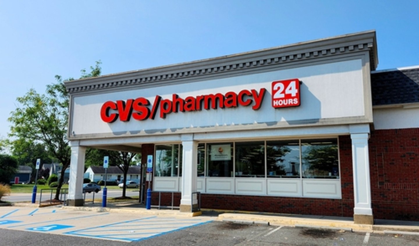
CVS Refreshing Its Namesake Own Brand

The growth of private label across a multitude of retail channels was on display during the opening day of the annual Velocity Conference + Expo in Charlotte, N.C.
With a theme largely focused on how to build on the growth seen across the industry in recent years, several retailers discussed their efforts to modernize their respective private brands while also identifying new opportunities to further enhance engagement with shoppers.
Perhaps the day’s biggest news came from CVS.
Mike Wier, vice president of Store Brands at CVS Health, noted the company is refreshing its entire CVS brand portfolio, which includes approximately 3,000 items. The effort, he said, uses some of the same principles CVS employed when launching its Well Market brand in 2024.
“It’s an exciting proposition and a big opportunity for us to lead the industry,” he said. “Inasmuch as we’re a follower in the food categories, we have to be a leader in healthcare.”
The need to update the CVS brand with a focus on packaging design stemmed in part from a review of the drugstore chain’s ibuprofen and acetaminophen assortment, including both branded and private label products. During the review, the individual accompanying Wier—whom he described as a former private label leader—asked to see the CVS-branded assortment in the two pain relievers.
“We were standing right in front of CVS’s products for about 10 minutes, and it was as if they just faded into the background,” he said.
Additional details on the CVS private label rebrand are expected to be made public in the coming weeks.
The aforementioned Well Market line has been in CVS stores since debuting in the spring of 2024, with the retailer now some nine months into a full-scale launch. Wier said the line is exceeding expectations.
“Well Market was a branding project as much as a flavor and trend project,” he said. “It was a transformation of our snack line and an opportunity for us to lean into snacks in a different way. But it’s not just about the brand—it’s also about the products that go inside. We had to ensure a high degree of quality, offer mainstream products, but also appeal to more of that frontier edge of flavor within the snacking space.”
Similar to the drug chains, convenience store retailers in recent years have also focused their efforts on building their private label assortments. Casey’s is one example of a c-store chain that recognized a growth opportunity but also realized it needed to do more to help its own-brand products stand out on the shelf.
The Ankeny, Iowa-based retailer began its private label retooling effort in 2020, when officials recognized the need to build out its own brand assortment, which at the time had about 300 items. Dana Sump, private brand manager at Casey’s, recalled those 300 products performed well early on, driving profits, but then stagnated.
“We had so many items throughout the center of the store and then in the cooler, and it was like a sea of red,” he recalled, referencing the red product packaging of Casey’s own brand. “While it was very on-brand for Casey’s, we thought, ‘Where do we go from here?’”
Sump said Casey’s wanted to evolve its brand, become a more contemporary version of itself, and make the private label assortment relevant for its shoppers for the next 50 years.
“We weren’t happy anymore with the results that we were getting,” he said.
Casey’s enlisted the help of Marketing By Design (MBD) to lead an extensive redesign of its product packaging, which included focus groups and an analysis of the c-store’s product assortment.
“We started with defining the voice of Casey’s private brand and did interviews with everyone from the CEO on down to store managers,” said Maria Dubuc, president of MBD. “We got some really great insights and found that everybody was ready for a change. They wanted some products at a higher level and were a bit tired and bored with the sea of red that Dana mentioned.”
Ultimately, Casey’s chose to focus on its Casey’s brand and redesign product packaging to downplay the red that had long been used, bringing in different colors that allow individual items to stand out on the shelf.
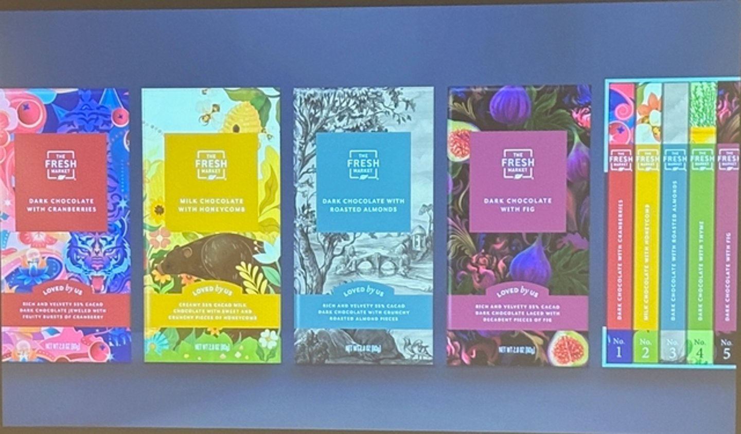
The need to refresh was also a major motivator for The Fresh Market.
“When a brand loses relevance with its guest is when that brand begins to die,” said Michelle Beck, director of Own Brands at The Fresh Market. “When we’re doing our jobs right, it sparks something real in people—an emotion. We’re not just building stores; we’re building brands and crafting love stories between our guests and the products that we believe in.”
When it came to designing its packaging, she said the Greensboro, N.C.-based grocer used the opportunity to reimagine its brand and create something its guests would believe in and love.
Bryan Bowers, creative director at The Fresh Market, said the first step was to remove a host of in-store signage that had a variety of typefaces and logos—items he termed “antiques.”
“They were fine for a while, but it just needed a refresh,” he said.
While aesthetics were a key part of the refresh that began in center store, upgrades to the product assortment were equally important. New selections such as breakfast items were added to the deli, in-store roasting of coffee beans and grinding as needed became part of the selection, and items such as pizza, ribs, salmon, and pulled pork became menu staples.
The next step was product packaging, and the grocer’s senior leadership had an ambitious request: redesign 700 items in one year.
While the previous design ethos for The Fresh Market’s own brand product packaging emphasized consistency across the store, that strategy was now out the window.
“We wanted to have fun, we wanted a personality, and we were really tired of taking ourselves so seriously,” Beck said. “We also had all these great legacy items that we and our guests love, and we lost all of those stories in that last redesign, in that push for consistency.”
The newly designed product packaging for its own brands does offer more personality. Perhaps the best example of the grocer’s effort to think outside the box is its newly designed coffee cup.
When the fully illustrated cup featuring The Fresh Market logo was presented by design firm Equator, Bowers felt it was prudent to get buy-in from the company’s CEO. Thinking approval was a long shot, the decision from the chief executive was surprisingly swift.
“He just looked at the options and said, ‘That one,’ choosing the design that is now in use,” he said. “When we asked why, he said it just made him smile. That was the emotional response we were looking for.”